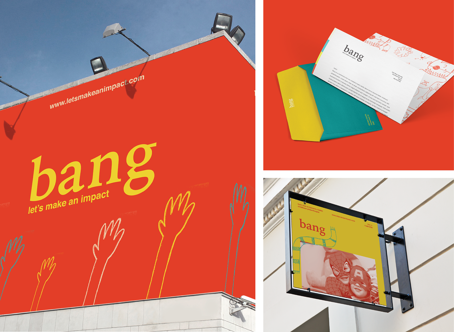
Challenge This project challenged me because the “bang” conference is targeted toward adults, but about children. The style I chose for this project needed to both cater to the eye of an adult and the spirit of a child.
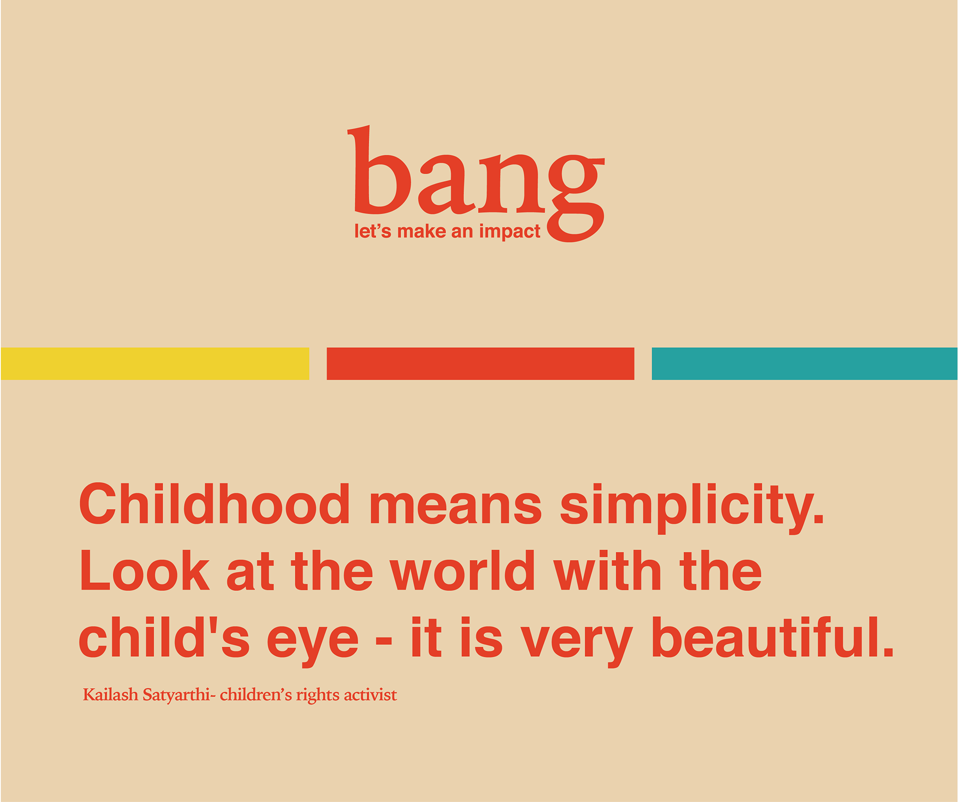
Concept In order to mesh these two styles, I used a classic sans-serif, Helvetica, and a serif with a bit of character, Alegreya. I also contrasted child-like illustrations and photography to represent the two styles, as well.
Result The result is a conference that caters to adults, while keeping the main subject of children at the heart of the conference branding.